2022
REDESIGNING SEARCH + FILTERS
A new intuitive and multi-search experience for Cashbook App : UPI Wallet for Employees (YC W21)🔎
IMPACT : ↑60X daily unique searches and ↑32x weekly unique applied filters

What Cashbook App does
Cashbook is a digital ledger app for financial management, enabling businesses to track transactions, manage expenses, and integrate UPI wallets for employee reimbursements and payments.
Team
Product Design Lead
Engineering Team
Growth and Data Team
Timeline
10 Weeks, Feb-April 2022
My Role
Lead Designer
PROBLEM STATEMENT
How might we create a more advanced search while also solving for easily adoptable filters.
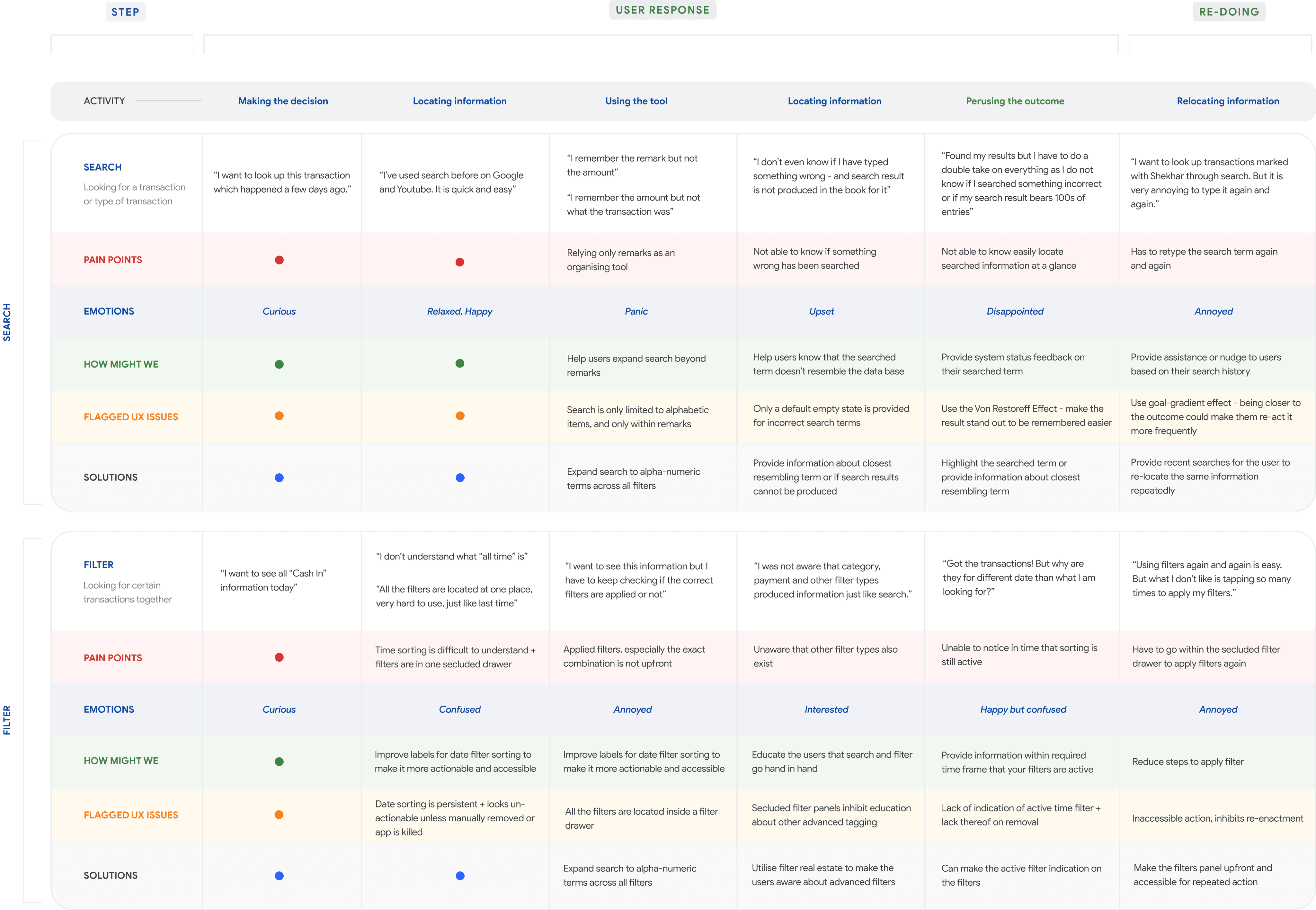
USER'S SEARCH + FILTER JOURNEY WITHIN THE APP

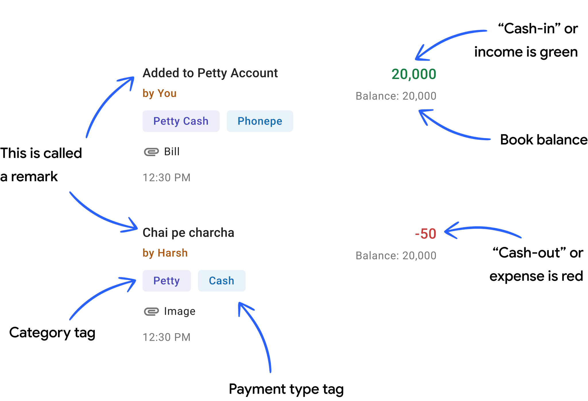
ANATOMY OF A CASHBOOK "ENTRY"
A Cashbook is a digital ledger of transactions. Users can filter, search, and download entries for sharing, organising, or future use.
HOW SEARCH AND FILTERS ARE DIFFERENT FROM EACH OTHER
🔎 Search
Pro :
Provides exact information
Can power filters through hyper-specialised search
Cons :
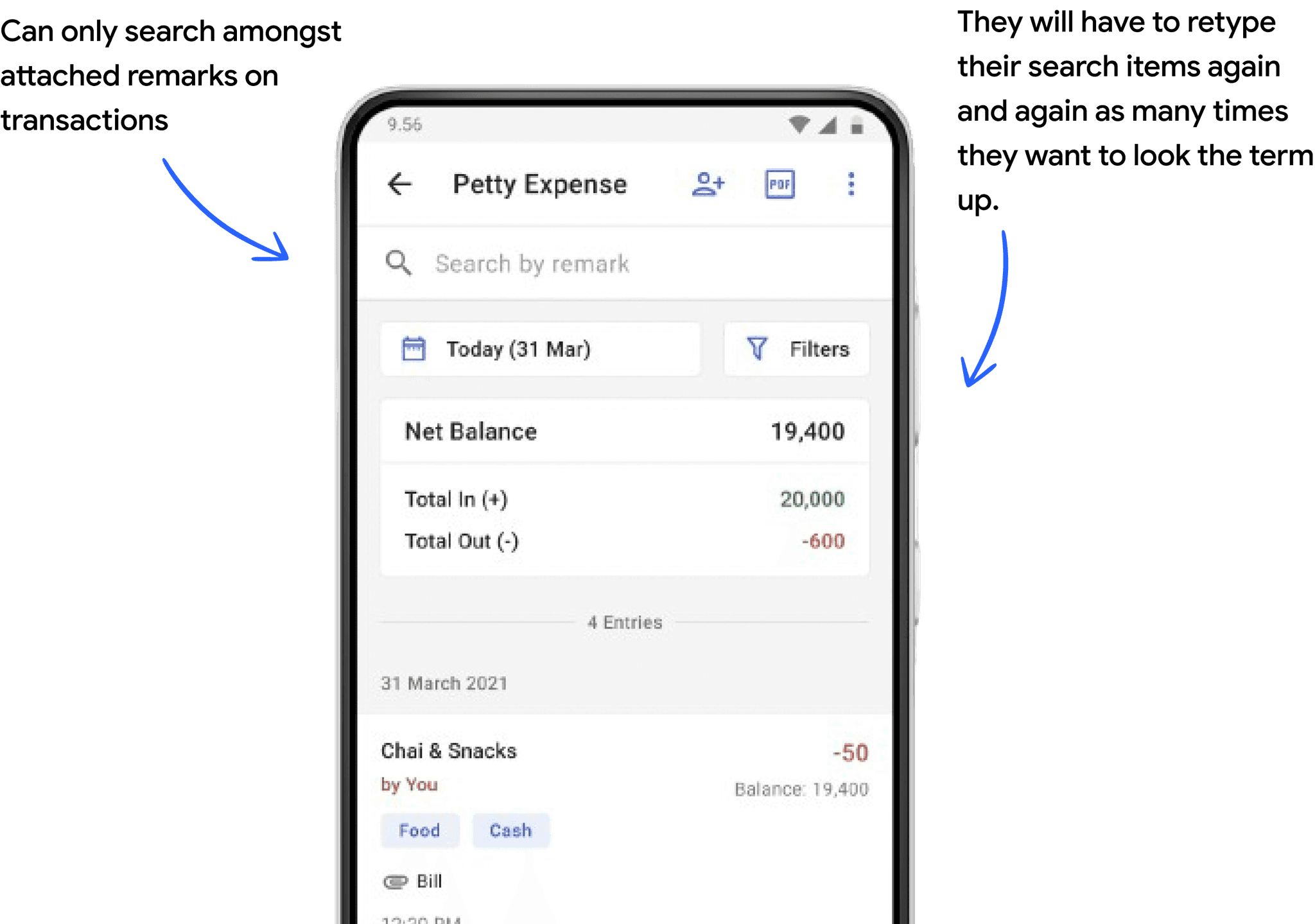
Non persistent user has to search the term each time they want to look up that information
Can only search amongst remarks attached to a transaction
🗂️ Filters
Pro :
Fetches transactions on the basis of entry types or sort by time
Is persistent, unless cleared
Can power search, can be grouped together
Cons :
Hidden and persistent, can hamper information fetch if applied and forgotten
EXISTING DATA
Users tapped on filters more than search but applied search more than filters.
Data from December 2021 to March 2022.
1.03M
times filter icon was tapped
753.6K
times filter was applied
866.1K
focused search was applied
5K
focused search was applied daily
9K
filters applied weekly
PROBLEM BREAKDOWN
What could be improved?
I did deep dive into our users search behaviour, while addressing the unique nuances of their specific patterns of search and filters usage and looking at major painpoints across user's search and filter journey within the app.
🔗 Dis-harmony between search and filter usage
Users are more familiar with search experience than with using filters which were more obvious for users.
🔕 Lack of system status feedback
Improper accounting for user behaviour errors and edge cases such as incorrect search detection
💡 Limited discovery of advanced filter options
Search and filters be leveraged to educate/inform users of advanced features
USER EXPERIENCE RESEARCH
My user research was conducted through extensive user calls, heuristic evaluation, and data analysis from Mixpanel and Dovetail.
Search
"Sometimes I only recall the amount. My staff uses remarks but skips tagging entries with categories or payment types as they’re unaware of filters"
Search
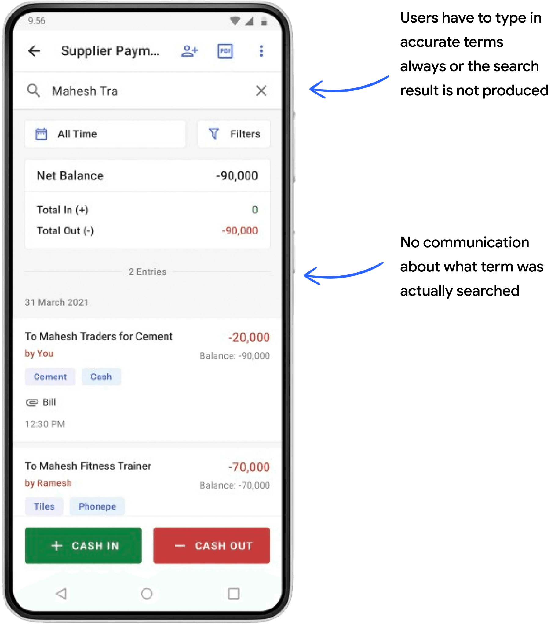
"I need to type exact words for results, and I’m unsure if they’re accurate since nothing is highlighted in the book"
Filter
"I don’t use filters because I’m unaware they exist or what they do."
"Filters are hard to access—it takes too many taps to apply and view them."
Filter
"I should know which filters are applied and when."
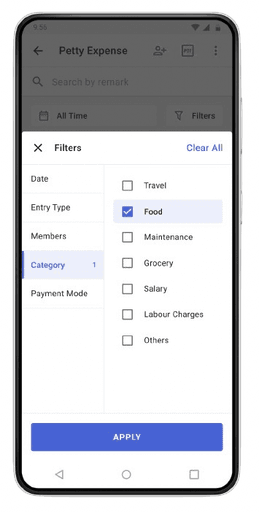
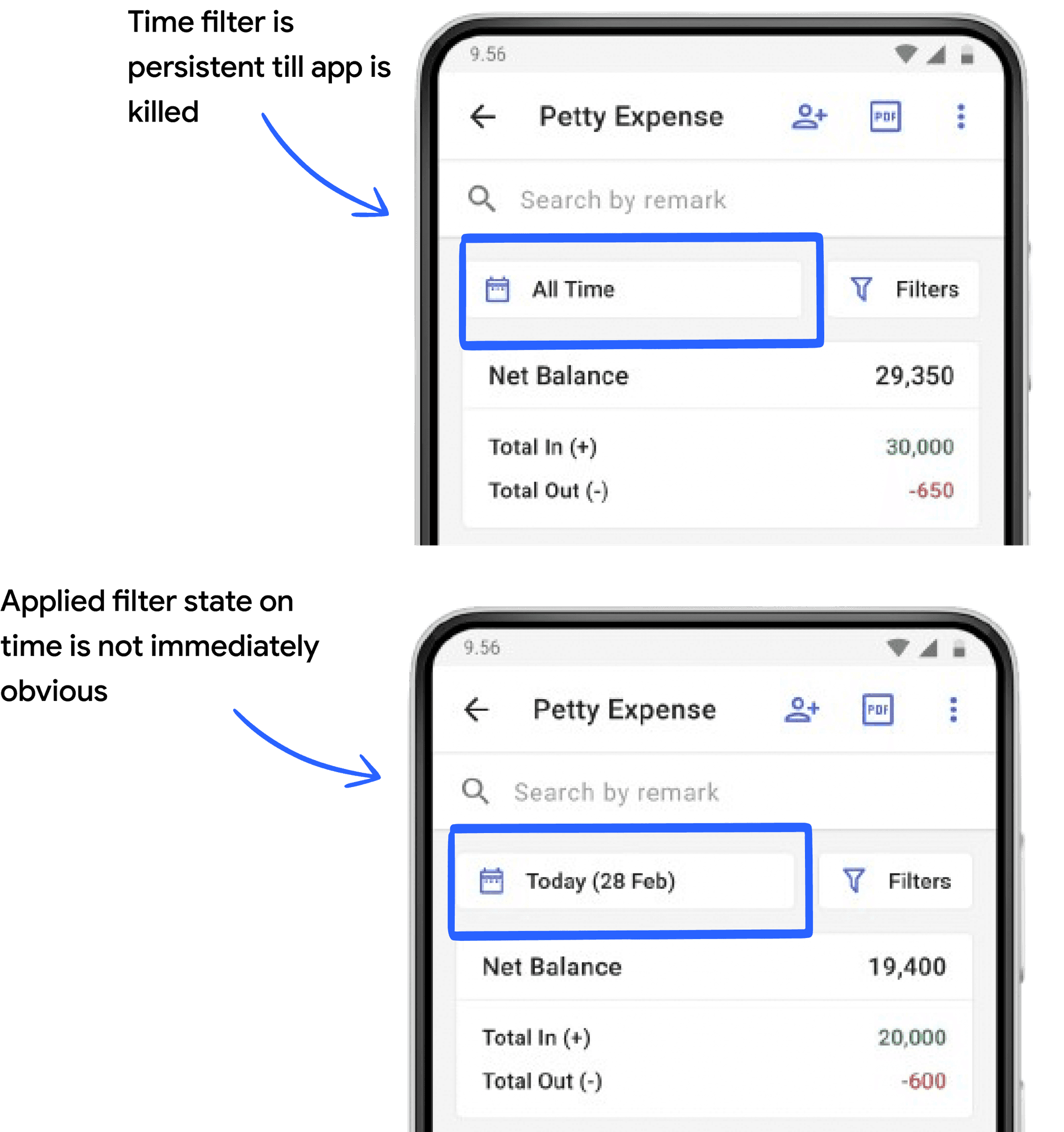
"All Time filters are unclear to me."
Search + Filter
"I use Search to customize results with remarks, though I can’t search by amount yet. I avoid filters because they’re too much effort—Search does the same job."
Filter
"I know how to use Search, but if I only recall an amount or phone number—not tags or remarks—I can’t find the transaction."
KEY PROBLEMS IDENTIFIED
Search Limitations:
Inflexible search (exact match required).
No support for searching by amount or phone number.
Lack of visual feedback (e.g., highlighting).
Filter Usability:
High effort to apply and view filters.
Poor visibility into active filters.
Confusing filter terminology (e.g., "All Time").
User workarounds:
Users rely on Search as a substitute for filters, indicating low understanding and discoverability of filters.
DESIGN EVOLUTION THROUGH EMPATHY MAPPING
What does a user think, feel and do during the process of using search and/or applying filters?
NEXT STEPS FOR UX IMPROVEMENT
Simplify and streamline filter accessibility.
Enhance search functionality (e.g., support for amount, phone number, and partial matches).
Improve visual feedback (e.g., highlighting searched terms).
Educate users about filters through onboarding or tooltips.
Clarify filter labels (e.g., replace "All Time" with clearer terms).
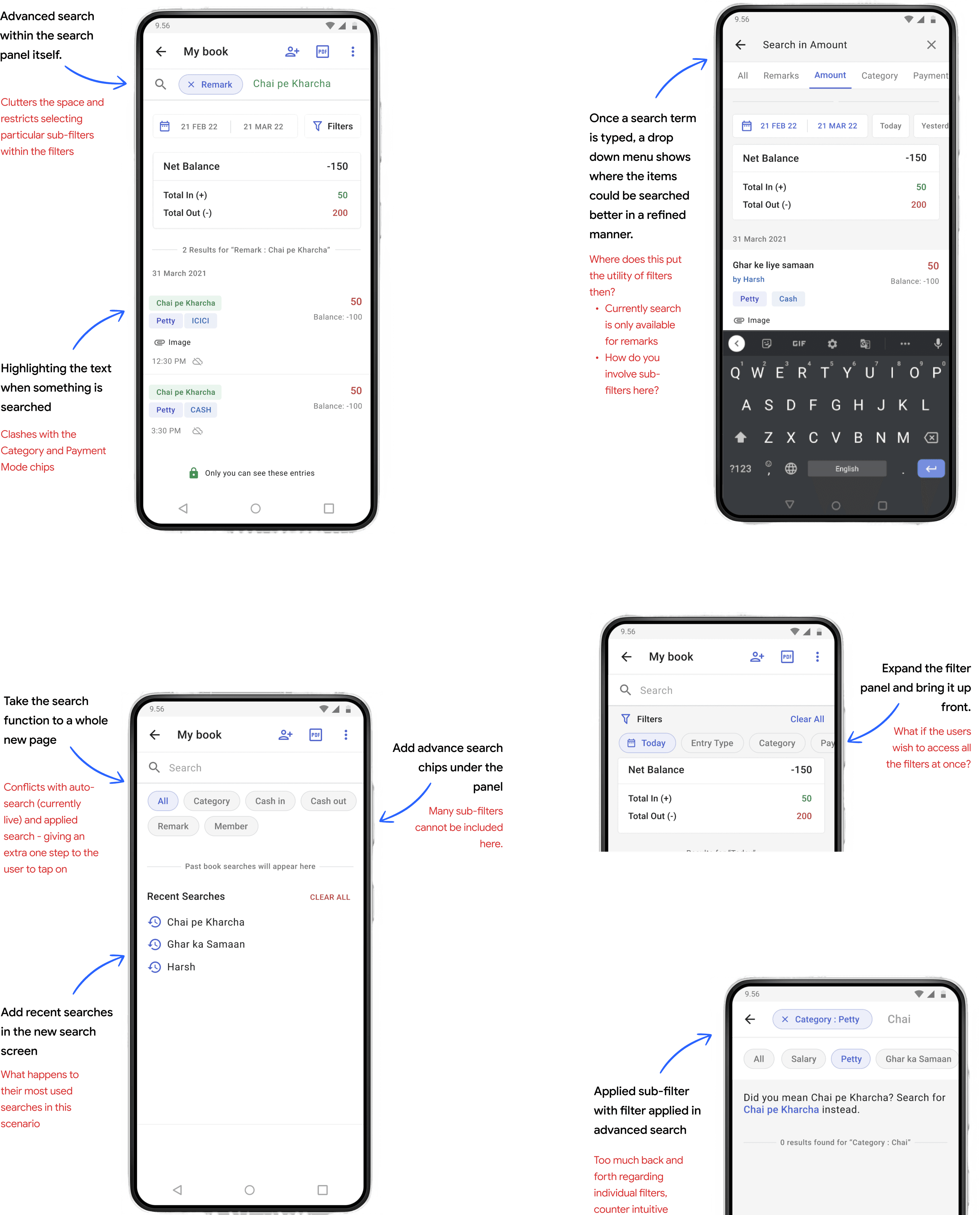
DESIGN EXPLORATIONS
I came up with many concepts in the earlier of design explorations. Some of the ideas did translate into solid concepts that landed in the final hi-fidelity version.
USABILITY TESTING
We used rapid testing and iteration with theThink Aloud Walkthrough method.
10 Sessions
Used a hi-fidelity prototype of the app online via Google Meets/Zoom with users
08 Participants
Tested with small businesses like shop owners and medium businesses
60-90 Mins/Session
Participants were given a task to complete and think aloud during the task
Determined the cohort for the testing : Volunteer users had small enterprises, bigger businesses, and individual businesses.
Defined the task list : Users completed smaller user flows and spoke out aloud as they completed the funnel.
Consolidated the findings : Each flow was divided into micro-tasks, and evaluated any blockages, dependencies, confusion or feedback of all the micro-steps.
Iterated on the learnings : I iterated on the feedback and readied the file for engineering handover.
Search an item as usual
Use advanced search tabs
Use time filter to find transactions
Apply a filter from the new panel
Apply filters and search together
"The new filters are easier to find and use, and I love searching within Remarks and Amount—though the layout took some getting used to."
FINDINGS FROM THE FIRST DESIGN MVP
👍 New filter panel passes checks!
The new filter tray was easily detectable and usable, though the layout was a significant change.
Loved search in remarks & amount !🔦
Users easily located and use basic and advanced search, appreciating the ability to search within Remarks and Amount.
FINAL DESIGNS
Introducing the new search and filter experience
SEARCH
Alpha-Numeric Search
Search now supports alpha-numeric terms across All, Remarks, and Amount categories, with searched terms highlighted in yellow for easy visibility.


FILTERS
Filters One Tap Away
Updated the filter icon for better recognition and enhanced the filter panel with advanced features for ease of use.
EDGE CASE
Smart Nudge for Similar Items
Introduced a smart nudge showing similar items for incorrectly spelt search


SEARCH + FILTERS
2X Powerful Search
Added a recent search screen to save user effort, with filter tabs enabling search within applied filters, doubling functionality.
IMPACT
Key metrics across a 3 month period
↑300K
daily unique searches
FROM A PREVIOUS 5K
↑280K
weekly unique filters
FROM A PREVIOUS 9K
In 3 months, search and filter adoption was account at a 5% MAU growth with daily unique searches surging from 5K to 300K, and weekly unique filter applications rising from 9K to 280K, showcasing significant user engagement and feature adoption.
CONCLUDING WITH SOME IMPORTANT LEARNINGS
Iterative Testing is Crucial:
Rapid testing with the Think Aloud method helped identify pain points early and to validate designs and catch issues before development.
Balance Familiarity and Innovation:
The new filter tray layout, while effective, initially confused users. I learned to balance innovation with familiar patterns to ease user adaptation.
Simplicity Over Complexity:
The advanced search prototype confused users. I learned to prioritise simplicity and introduce complexity gradually through progressive disclosure.
Scroll back to the top