Product Design
PRODUCT DESIGN
Helping Jar users save better through their spends analysis
My Role
Developing, conceptualising, executing the solutions from the scoping till the pre-dev stage followed by post-dev support for the fit-and-finish of the final build.
Timeline
Nov-Dec 2023
Setting the Context
Jar is a micro-savings app fintech start up in India solving for financial fitness in Tier 2 & Tier 3 cities. Our app tries to educate and create financially fitter Indians by encouraging them to save everyday in the form of digital gold. In this context, Spends Tracker aimed to solve for better financial management for our users by giving context of their spending frequencies, habits and patterns.
Spends Tracker V1 went live in March 2023 and V2 rolled out in January this year.

Glimpse of the redesign
Issues with Spends Tracker, V1
To begin with, a key problem was an overall generally low engagement, retention and user interest, and that was because we told them WHAT they were spending, but not HOW they were spending, making the expense information half baked and very rudimentary and replaceable for the users. We also did not have data sanity at all - which meant we had no insight into the spending pattern, behaviour or requirements in the form of filters or categories. This also meant users could flag incorrect transactions, but on its own, a lot of times, investments were also filed under expenses within a month. Another issue we wanted to solve for was all expenses getting clubbed into one umbrella account and there was no information about which account had what kind of expense.

What Spends Tracker V1 looked like
Our main objective was that we wanted to encourage users to start saving after looking at their spending patterns. This was not happening, corroborated by the inferences we received from the data team.
Understanding User Emotions

Storyboarding as a process of solutioning
How our average users spend their money
Without empathising with the user’s spending habits, any solution will be partial. Let’s break down our understanding here.The basis of this understanding was realising that we have roughly the following types of spends :
Recurring - EMIs, Credit Cards
Fixed - Investments, SIPs, Rent
Everyday - Groceries, transport, entertainment, etc
Sudden/Un-anticipated - Big purchases, medical bills, etc

Snippet from an actual brainstorm session in office

How spends information could provide utility for our users on a micro level
Establishing this relation helped us focus on the utility of money as well. A lot of back and forth of ideas was done using actual user scenarios and/or use cases that were shared with us through our company-wide daily Jar user-verse blurbs consolidated by our user experience research team.
We were also able to empathise about how we spend money by using our own experiences and emotions regarding money. For example, how multiple accounts are used and relegated to different types of spending, how joint accounts could work, how we can divide the lump of category information into smaller, better buckets, etc.
The diagram on the left helped us develop the user narrative of the landing page monumentally. Because V1 was so limited in its offerings, it was almost like we had to recreate value and rebuild it from the scratch.
How might we questions along the way
We then brainstormed, about how apart from providing information to the users about their spends, additional value could be created so that they visit this flow again and again. We focused on creating incentivisation so that our users can see merit in saving with us.
Mitigate the confusion around balance information as we're more focused on spends on this screen
Incorporate gamification to incentivise revisits on this page more, i.e. setting limits
Improve categorisation by utilising metadata from combing thousands of texts
Add deeper personalisation by adding contextual cross-selling cards for a higher CTR
Create a better transaction experience by adding functionality related to information location
Add elements of delight such as "save in gold" nudge as per, pop-ups nearing pay-days, etc.
Creating a user journey like the one below helped me identify any edge or left-out cases, prioritise information and flag any additional logic requirements from the product manager for the project. It also helped me take all the cases in a step-by-step manner.

What the final results looked like
The landing page revamp
The first focus is now on Spends, and the multiple bank icons.
You (the user), who has not set a spends limit, will get information about their daily average spends across a week. This acts as a nudge to set the limits.
The consecutive element is setting the limit itself, followed by categories. This is then followed by a graph showing the spends across 3 months, and then a separate page where all transactions can be seen. The last element is a cross-selling card encouraging the users to set up Daily Savings.
Prototype of the Spends Tracker V2 landing page
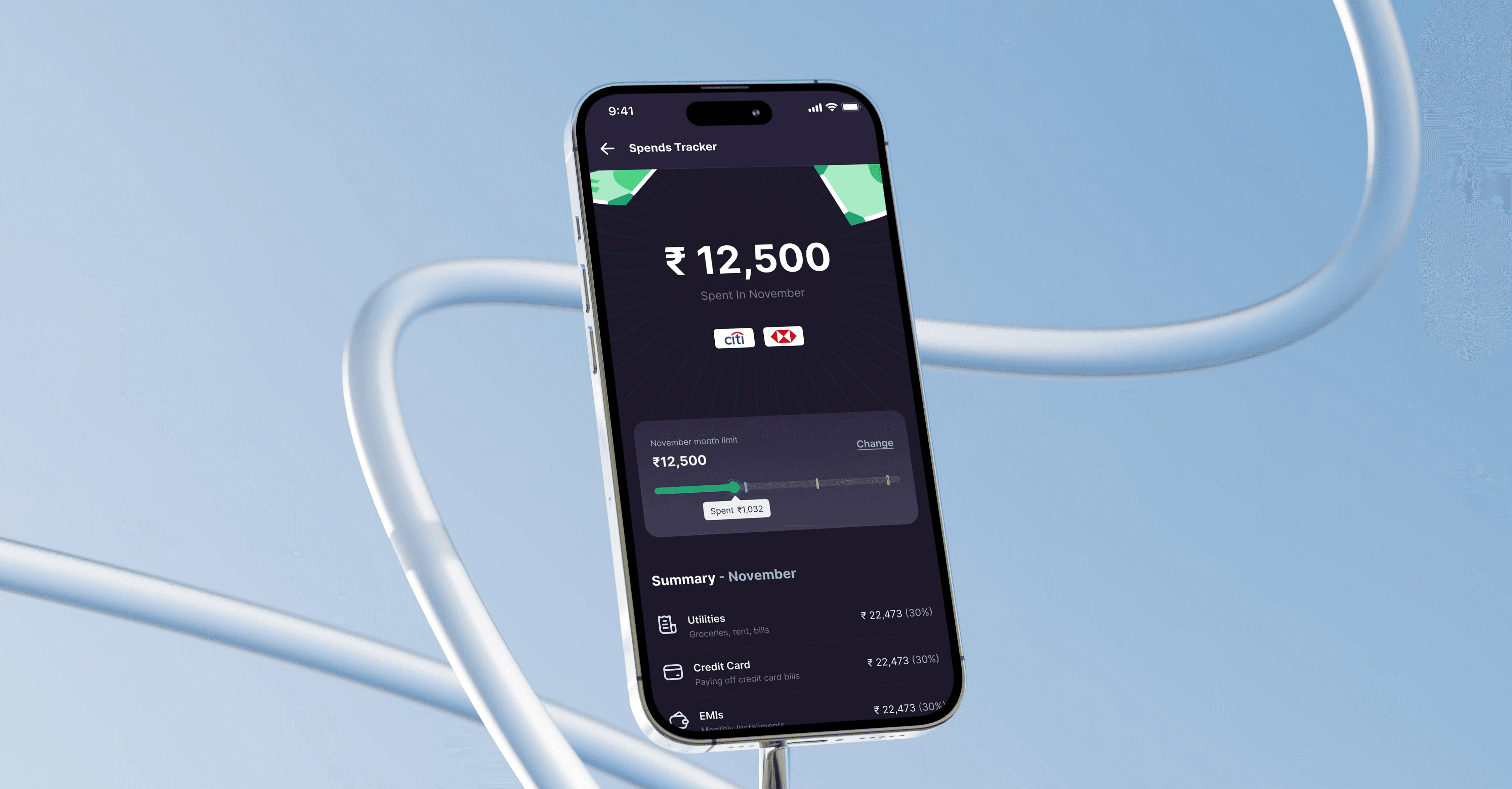
Gamification via setting spends limit
Once the user has set a limit, the spends widget shows up which looks like a progress bar. We have three zones in spends - green, purple, yellow, and red zones. Zones amount to spends in the following way :
Green - 0% to 35%
Purple - 35% to 65%
Yellow - 65 % to 85%
Red - 85% and above
If you’ve reached the red zone, you are provided with a one-time haptic every time you come to this screen - the spends card shakes/vibrates to denote a sense of alert.
If you’ve crossed the limit but the month has not ended or you’ve not increased your limit, you will be notified the amount with which your spends has exceeded.
Once the month ends and you’ve stayed within the limit, you will get the nudge to buy gold manually. This nudge only remains for 24 hours at the month end and then disappears.

All 5 states of the spends limit widget
Transaction tab in action
An advanced transaction tab
A big difference from the V1 is adding a separate transactions record screen in V2. While an important part of the information you can peruse, it was an exercise in prioritising UI real estate and would also work to incorporate filters better. We used data to check allot an accurate serial positioning to the filters. The order was - Banks, Categories, Amount, and Month. The applied filter categories would show only the number of filters applied via checkboxes and not the names. The filters were divided into :
Categories reflected the same categories shown on the landing page
Months currently only catered to 3 months, however, post design handover, we also kept the idea open of increasing this time frame in the future.
Banks included all the banks deciphered through transaction texts - however we distinguished them using account/card details on the right side
Only amount filter had radio buttons, rest had checkboxes.

All the different categories, consolidated
Contextual cross-selling cards + categorisation buckets
Action state of the Pay-day nudge which adds a sense of delight

Contextual cross-selling cards based on previous transactions

Full expanded state of the categories on landing page
© Soumya Raj 2024